Masonry 瀑布流 CSS VS JS

发布于2025-08-06 | 更新于2025-08-13
Masonry 是前端比较常见的布局方式,不同元素按照紧密填充的规则排列 —— 即下一行的元素会自动填补上一行留下的空白空间,形成错落有致、类似瀑布倾泻的视觉效果。
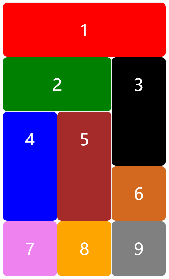
Grid 网格布局
Grid 更适合固定布局,定宽定高的情况,但是利用他的特性也能实现类似瀑布流的效果,但对于变宽变高的情况就明显支持不足,因为“网格”布局,每行每列的网格格子都是倾向于与前一个格子保持一致的,除非设置跨行跨列,这样其尺寸也是相对于格子来说规则地成倍变大,Grid 不适用无规则的变化。
<html>
  <style>
    .container {
      display: grid;
      grid-template-columns: repeat(3, 100px);
      grid-template-rows: repeat(3, 100px);
      grid-auto-flow: row dense;
    }

    .container div {
      text-align: center;
      line-height: 100px;
      border: 1px solid #eee;
      border-radius: 8px;
      font-size: 30px;
    }
  </style>

  <body>
    <div class="container" style="color: white">
      <div style="background: red; grid-column-start: span 3">1</div>
      <div style="background: green; grid-column-start: span 2">2</div>
      <div style="background: black; grid-row-start: span 2">3</div>
      <div style="background: blue; grid-row-start: span 2">4</div>
      <div style="background: brown; grid-row-start: span 2">5</div>
      <div style="background: chocolate">6</div>
      <div style="background: violet">7</div>
      <div style="background: orange">8</div>
      <div style="background: gray">9</div>
    </div>
  </body>
</html>
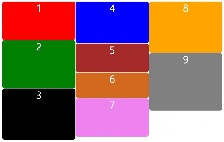
Column 列布局
多列布局会将容器内的内容按照设定的列数或列宽分配到多列中,并试图自动平衡每列的高度,但视觉上并不是最平衡,从上到下,再从左到右填充内容,这种顺序是不可以更改的,这就带来了局限性,懒加载会引起重新布局,不支持跨列,响应式布局需要配合媒体查询,有可能会发生某个项在中间被截断到下一列,不能忘记写 break-inside: avoid;,所以其适用于宽度一致,高度动态可变,对顺序、排列、懒加载要求不高的场景。
<html>
  <style>
    .container {
      column-count: 3;
      column-gap: 0px;
    }

    .container div {
      break-inside: avoid;
      text-align: center;
      border: 1px solid #eee;
      border-radius: 8px;
      font-size: 30px;
    }
  </style>

  <body>
    <div class="container" style="color: white">
      <div style="background: red; height: 120px">1</div>
      <div style="background: green; height: 150px">2</div>
      <div style="background: black; height: 160px">3</div>
      <div style="background: blue; height: 130px">4</div>
      <div style="background: brown; height: 90px">5</div>
      <div style="background: chocolate; height: 80px">6</div>
      <div style="background: violet; height: 120px">7</div>
      <div style="background: orange; height: 160px">8</div>
      <div style="background: gray; height: 180px">9</div>
    </div>
  </body>
</html>
JS
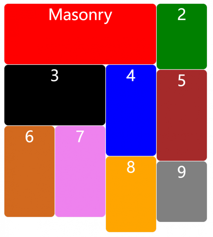
开源项目 masonry 很好地利用 JS 实现了瀑布流布局,他基于 outlayer 作为基础布局创建了瀑布流布局,所以在学习源码的过程中,需要两个项目结合着阅读。以下是核心实现思路。
<html>
  <style>
    .container {
      position: relative;
      width: 400px;
      padding: 10px;
      color: white;
    }

    .container div {
      box-sizing: border-box;
      width: 100px;
      text-align: center;
      border: 1px solid #eee;
      border-radius: 8px;
      font-size: 30px;
    }
  </style>

  <body>
    <div class="container">
      <div style="background: red; height: 120px; width: 300px">Masonry</div>
      <div style="background: green; height: 130px">2</div>
      <div style="background: black; height: 120px; width: 200px">3</div>
      <div style="background: blue; height: 180px">4</div>
      <div style="background: brown; height: 180px">5</div>
      <div style="background: chocolate; height: 180px">6</div>
      <div style="background: violet; height: 180px">7</div>
      <div style="background: orange; height: 150px">8</div>
      <div style="background: gray; height: 120px">9</div>
    </div>
  </body>

  <script>
    // 列表项构造函数
    function Item(element, layout) {
      this.element = element
      this.layout = layout
      this.position = {
        x: 0,
        y: 0,
      }
      this._create()
    }

    const itemProto = Item.prototype
    itemProto.constructor = Item

    itemProto._create = function() {
      this.css({
        position: 'absolute',
      })
    }

    itemProto.css = function(style) {
      const elemStyle = this.element.style

      for (const prop in style) {
        elemStyle[prop] = style[prop]
      }
    }

    itemProto.getSize = function() {
      this.size = getSize(this.element)
    }

    itemProto.goTo = function(x, y) {
      this.setPosition(x, y)
      this.layoutPosition()
    }

    itemProto.setPosition = function(x, y) {
      this.position.x = parseFloat(x)
      this.position.y = parseFloat(y)
    }

    itemProto.layoutPosition = function() {
      const layoutSize = this.layout.size
      const style = {}

      // x
      const xPadding = 'paddingLeft'
      const xProperty = 'left'

      const x = this.position.x + layoutSize[ xPadding ]
      style[ xProperty ] = x + 'px'

      // y
      const yPadding = 'paddingTop'
      const yProperty = 'top'

      const y = this.position.y + layoutSize[ yPadding ]
      style[ yProperty ] = y + 'px'

      this.css(style)
    }

    // 布局构造函数
    function Layer(element, options = {}) {
      const queryElement = document.querySelector(element) // 获取父节点
      this.element = queryElement
      this.size = {}
      this.options = options
      this.items = []
      this._create()
    }

    const layerProto = Layer.prototype
    layerProto.constructor = Layer

    layerProto._create = function() {
      const children = this.element.children
      const items = []
      // 收集子节点创建列表项实例
      for (let i = 0; i < children.length; i++) {
        const ele = children[i]
        const item = new Item(ele, this)
        items.push(item)
      }
      this.items = items
    }

    layerProto.layout = function() {
      // 计算布局尺寸
      this._resetLayout()
      // 获取容器宽度
      this.containerWidth = this.size.innerWidth
      // 列宽
      this.columnWidth = this.options.columnWidth ?? 0
      // 间距
      this.gutter = this.options.gutter ?? 0

      // 根据参数 columnWidth 或者首个元素的宽度计算列数
      this.measureColumns()

      this.colYs = []
      for (let i = 0; i < this.cols; i++) {
        this.colYs.push(0)
      }

      // 排布子元素
      this.layoutItems()
    }

    layerProto._resetLayout = function() {
      this.getSize()
    }

    layerProto.getSize = function() {
      this.size = getSize(this.element)
    }

    layerProto.measureColumns = function() {
      // 未设置列宽则获取首个元素的宽度,或者直接取容器宽度
      if (!this.columnWidth) {
        const firstItem = this.items[0]
        const firstItemElem = firstItem && firstItem.element
        this.columnWidth = firstItemElem && getSize(firstItemElem).outerWidth || this.containerWidth
      }

      const columnWidth = this.columnWidth += this.gutter

      const containerWidth = this.containerWidth + this.gutter
      let cols = containerWidth / columnWidth
      const excess = columnWidth - (containerWidth % columnWidth)

      var mathMethod = excess && excess < 1 ? 'round' : 'floor'
      cols = Math[mathMethod](cols)
      // 最终列数
      this.cols = Math.max(cols, 1)
    }

    layerProto.layoutItems = function() {
      const items = this.items
      if (!items || !items.length) {
        return
      }
      const queue = []
      items.forEach(function(item) {
        const position = this._getItemLayoutPosition(item)
        position.item = item
        queue.push(position)
      }, this)

      this._processLayoutQueue(queue)
    }

    layerProto._processLayoutQueue = function(queue) {
      queue.forEach(function(obj, i) {
        this._positionItem(obj.item, obj.x, obj.y);
      }, this)
    }

    layerProto._positionItem = function(item, x, y) {
      item.goTo(x, y)
    }

    layerProto._getItemLayoutPosition = function(item) {
      item.getSize()
      const remainder = item.size.outerWidth % this.columnWidth
      const mathMethod = remainder && remainder < 1 ? 'round' : 'ceil'
      let colSpan = Math[mathMethod](item.size.outerWidth / this.columnWidth)
      colSpan = Math.min(colSpan, this.cols)
      const colPosition = this._getTopColPosition(colSpan)
      const position = {
        x: this.columnWidth * colPosition.col,
        y: colPosition.y
      }
      const setHeight = colPosition.y + item.size.outerHeight;
      const setMax = colSpan + colPosition.col;
      for (let i = colPosition.col; i < setMax; i++) {
        this.colYs[i] = setHeight;
      }
      return position;
    }

    layerProto._getTopColPosition = function(colSpan) {
      // 获取列组合,目的是从符合列宽条件的列组中获取最小的列
      const colGroup = this._getColGroup(colSpan)
      const minimumY = Math.min.apply(Math, colGroup)
      return {
        col: colGroup.indexOf(minimumY),
        y: minimumY,
      }
    }

    layerProto._getColGroup = function(colSpan) {
      if (colSpan < 2) {
        return this.colYs
      }

      const colGroup = []
      // 第一组:第 0 列 ~ 第 (colSpan-1) 列
      // 第二组:第 1 列 ~ 第 (colSpan) 列
      // ...
      // 最后一组:第 (this.cols - colSpan) 列 ~ 第 (this.cols - 1) 列
      // 因此组合的数量是 this.cols - colSpan + 1
      const groupCount = this.cols + 1 - colSpan
      for (let i = 0; i < groupCount; i++) {
        colGroup[i] = this._getColGroupY(i, colSpan);
      }
      return colGroup
    }

    layerProto._getColGroupY = function(col, colSpan) {
      if (colSpan < 2) {
        return this.colYs[col];
      }
      const groupColYs = this.colYs.slice(col, col + colSpan)
      return Math.max.apply(Math, groupColYs)
    }

    // 获取元素尺寸
    function getSize(element) {
      const  measurements = [
        'paddingLeft',
        'paddingRight',
        'paddingTop',
        'paddingBottom',
        'marginLeft',
        'marginRight',
        'marginTop',
        'marginBottom',
        'borderLeftWidth',
        'borderRightWidth',
        'borderTopWidth',
        'borderBottomWidth',
      ]

      const style = getComputedStyle(element)

      const size = {}
      size.width = element.offsetWidth
      size.height = element.offsetHeight
      const isBorderBox = size.isBorderBox = style.boxSizing == 'border-box'

      measurements.forEach(measurement => {
        const value = style[measurement]
        const num = parseFloat(value)
        size[measurement] = !isNaN(num) ? num : 0
      })

      const paddingWidth = size.paddingLeft + size.paddingRight
      const paddingHeight = size.paddingTop + size.paddingBottom
      const marginWidth = size.marginLeft + size.marginRight
      const marginHeight = size.marginTop + size.marginBottom
      const borderWidth = size.borderLeftWidth + size.borderRightWidth
      const borderHeight = size.borderTopWidth + size.borderBottomWidth

      const styleWidth = getStyleSize(style.width)
      if (styleWidth !== false) {
        size.width = styleWidth + (isBorderBox ? 0 : paddingWidth + borderWidth)
      }
      const styleHeight = getStyleSize(style.height)
      if (styleHeight !== false) {
        size.height = styleHeight + (isBorderBox ? 0 : paddingHeight + borderHeight)
      }

      size.innerWidth = size.width - (paddingWidth + borderWidth)
      size.innerHeight = size.height - (paddingHeight + borderHeight)

      size.outerWidth = size.width + marginWidth
      size.outerHeight = size.height + marginHeight

      return size
    }

    function getStyleSize(value) {
      let num = parseFloat(value)
      let isValid = value.indexOf('%') == -1 && !isNaN(num)
      return isValid && num
    }

    const layout = new Layer(
      '.container',
      { columnWidth: 100 }
    )
    layout.layout()
  </script>
</html>
如果涉及动态内容、复杂排序、精确布局控制或交互需求,JS 实现是更优选择。